


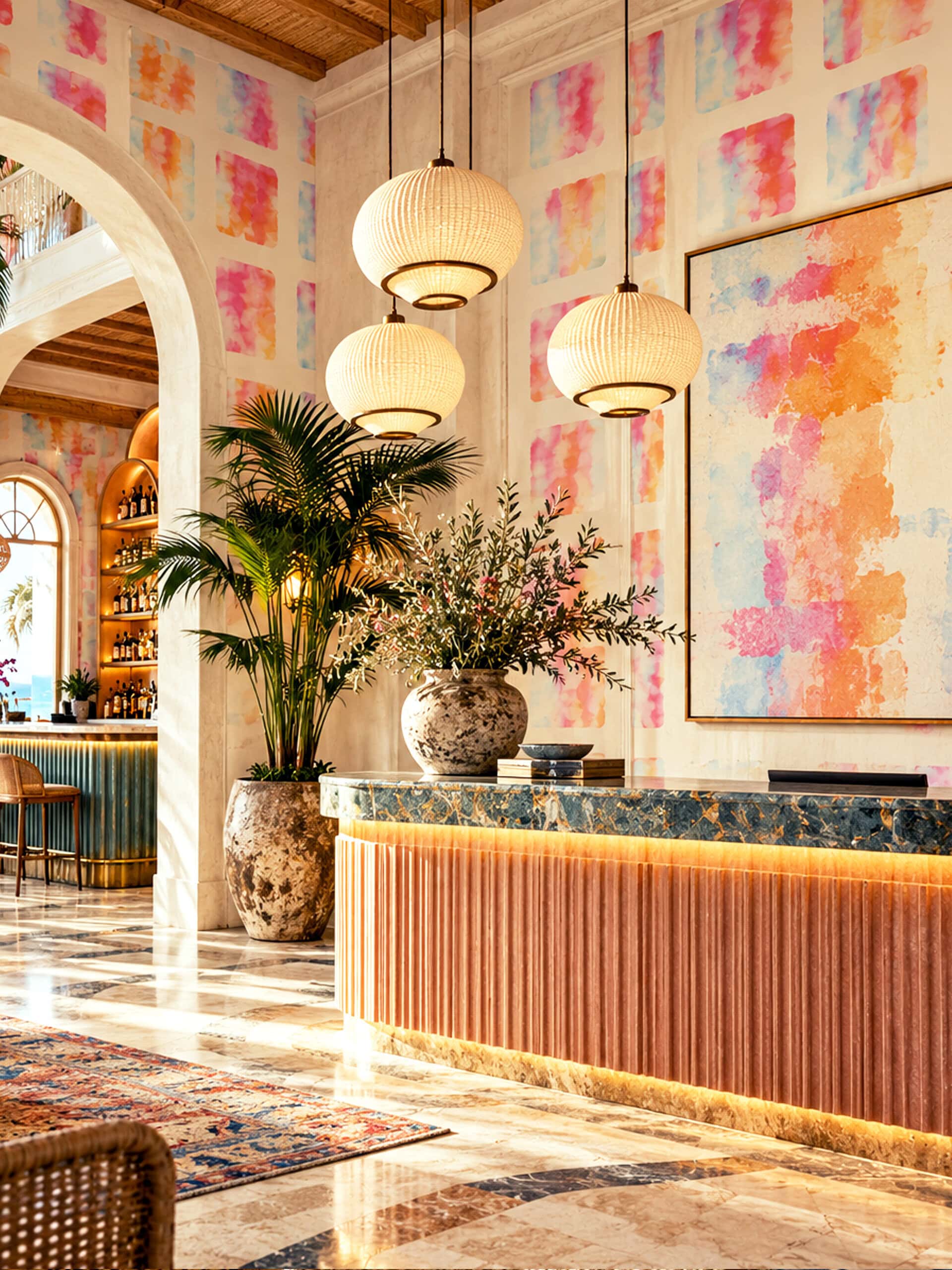
Pink Watercolour Wallpaper
Lotus Legacy Collection
This pink watercolour wallpaper arranges rows of soft-edged, rounded rectangles across a white ground, each one washed in translucent layers of rose, apricot, coral, lilac and pale blue. No two fields are alike: pigment pools, blooms and fades exactly as watercolour does on paper. The questions below explore the ideas behind it: the character of watercolour, the legacy of Colour Field painting, the quiet authority of the grid and the art of placing a contemporary pattern in a classical room.
787 907 Ft209 × 280 cm (széles × magas) · 63 EUR per sq m
What is pink watercolour wallpaper?
Pink watercolour wallpaper is a wallcovering in which pink is the dominant colour and is rendered with the qualities of watercolour painting: transparency, soft and irregular edges, gentle gradations and the characteristic blooms that form where pigment and water meet. Unlike flat, opaque printed colour, a watercolour surface appears to have depth, because lighter and darker layers remain visible through one another. In abstract designs, the motif is often reduced to simple shapes, such as squares, rectangles or loose fields, so that colour itself becomes the subject. The result sits closer to a painting than to a conventional decorative pattern, and the wall reads differently in morning light, at dusk and under lamplight.
What is Colour Field painting, and why does it still feel modern?
According to Tate, the term Colour Field painting describes the work of abstract painters of the 1950s and 1960s characterised by large areas of more or less flat, single colour. It was first applied to the work of Mark Rothko, Barnett Newman and Clyfford Still from around 1950; from about 1960, a more purely abstract form emerged in the work of Helen Frankenthaler, Morris Louis, Kenneth Noland, Alma Thomas, Sam Gilliam and others. Frankenthaler’s contribution is especially close to watercolour. As the National Gallery of Art in Washington explains, for Mountains and Sea (1952) she poured turpentine-thinned oil paint onto raw, unprimed canvas laid on the floor, so that the paint permeated the fabric and formed luminous pools of colour. Colour no longer sat on the surface; it became part of it. Rothko, meanwhile, cared deeply about how his paintings were experienced. In 1960 The Phillips Collection in Washington became the first American museum to dedicate a room to his work, and Rothko suggested lowering the lighting and placing a simple wooden bench rather than chairs in the space. The museum notes his preference for showing his art „in a scale of normal living”, an idea that makes Colour Field painting unusually relevant to the domestic interior.
Why does the grid matter in modern art and design?
The grid offers order without heaviness. It gives a composition a steady rhythm, lets the eye move calmly across a surface and allows small variations within each unit to become meaningful. In twentieth-century abstraction, few artists explored this more sensitively than Agnes Martin. As the Crystal Bridges Museum of American Art describes, Martin built her paintings on a rational grid, superimposing pencilled lines and later coloured bands on canvas stained with washes of colour, so that the colour often seems to float off the surface. At SFMOMA, a room of her paintings in pale colours is described as creating a quiet and contemplative atmosphere, and close looking reveals that her lines are not perfectly straight but carry small dips and imperfections that record the hand.
In wallpaper, the grid works in the same way. A regular arrangement gives a room calm and structure, while subtle differences from one unit to the next keep the surface alive and prevent it from feeling mechanical.
How do you pair contemporary wallpaper with a classical interior?
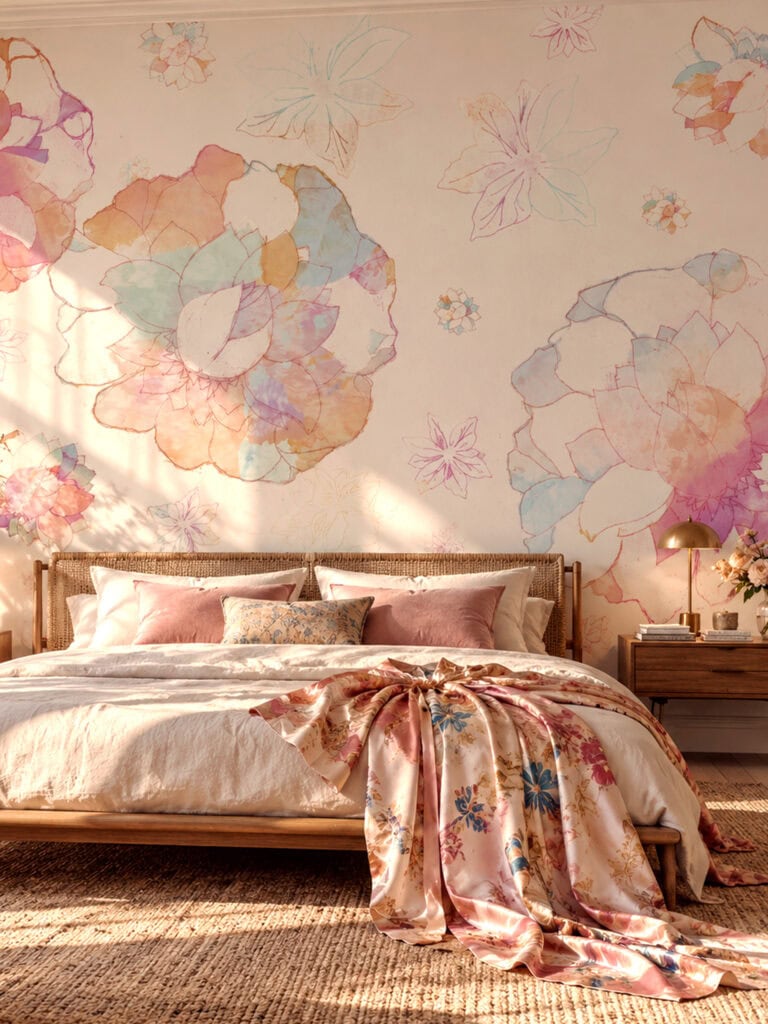
Contemporary wallpaper often looks most striking in rooms with strong historic architecture. Cornices, panelled walls, marble fireplaces and gilded mirrors provide a firm framework, and an abstract pattern placed within that framework creates a dialogue between periods rather than a clash.
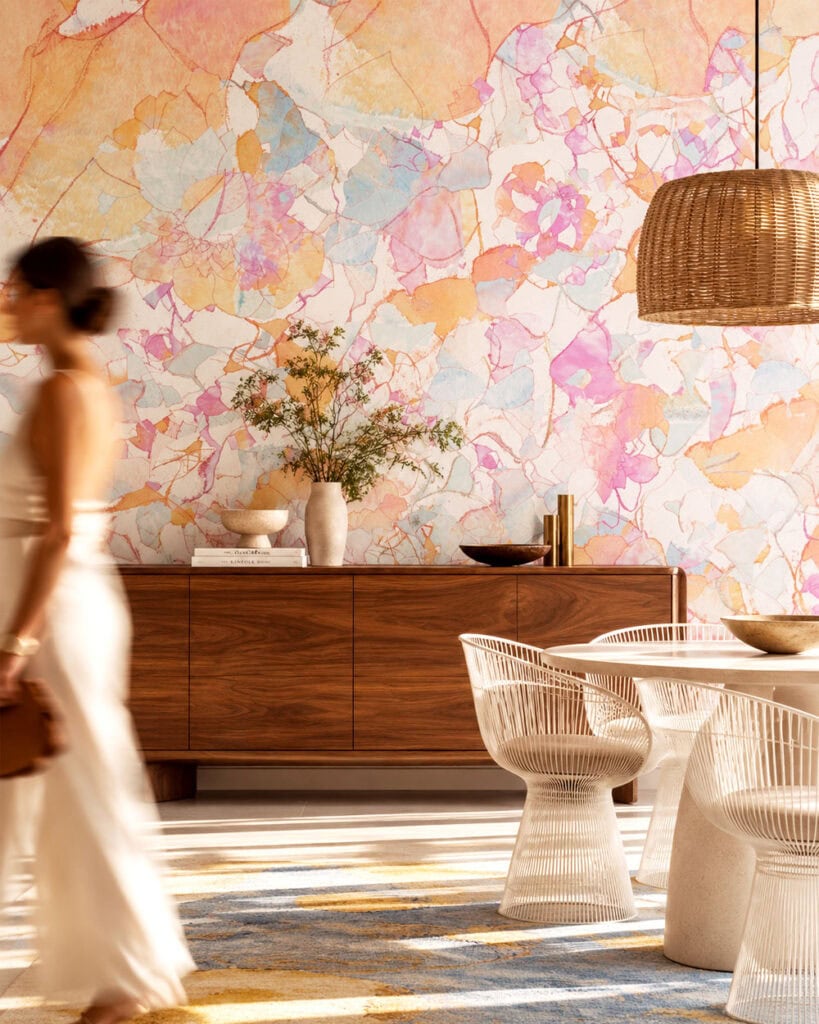
The key is to let the architecture and the pattern each keep their role. Paint mouldings and panelling a single, neutral colour so they read as structure; let the wallpaper supply the colour. Furniture can then move freely between eras: a mid-century sideboard, a velvet sofa in a saturated tone, a marble coffee table, a Moroccan-style rug and contemporary art all sit comfortably together when their colours echo the wall.
Soft, translucent colours are particularly forgiving in classical rooms, because they do not compete with ornament. They brighten the space, catch the changing daylight from tall windows and give period detail a fresh, contemporary context.
Pink Watercolour Wallpaper by Vesper Royale was designed with exactly this kind of dialogue in mind. Its rows of soft-edged rectangles in rose, apricot, coral, lilac and pale blue bring the luminosity of Colour Field painting and the calm of the grid into the room, whether it is a Parisian salon, a city apartment or a quiet bedroom. The mural is designed at 209 × 280 cm; for other sizes or an alternative palette, select „Want any changes?” on the product page.
Bold patterns need bold walls — minimum order 5 m². Enter your wall size in cm and we'll calculate the price for you.

Not sure yet? Touch it first.
Pick 3 samples.
Get 2 more on us.
Keep them, or pass them to a friend who's still living with beige. Spread the vibe — it always comes back around.
Made to order — production takes 5-7 working days, then shipped to your door.
Not sure this is right for your room? Write us an email or book a free 1-hour design consultation →
The Story
Styling This Wallpaper
Bought it.
Loved it.
Brag about it
We're a small studio, not a brand with a review army. Every word you leave here matters a lot to us, and it helps the next person find their wall.
— Barbara & the studioQuestions About This Pattern
Do I need an interior designer to choose the right wallpaper?
Not necessarily. Most people can choose confidently on their own — and if you'd like a second opinion, email us or book a free 1-hour design consultation with the studio for guidance on colour, pattern and placement. A paid consultation is only needed if you're after a full interior design service for your space, beyond just choosing a pattern.
Can I order a sample of this wallpaper first?
Yes — ordering a sample is optional but recommended. Screen colours can differ slightly from the printed result, so a sample confirms the exact tone in your own light before you commit to the full wall.
Can I customise the size or colour?
Size is always made to your exact wall dimensions — just enter height and width. Colour customisation is available for most designs; this piece is part of our standard collection, not a limited-edition print, so recolouring is possible on request.
How long does production take?
5-7 working days. Every Vesper Royale wallpaper is made to order — we hold no stock — so production begins only once you place your order.




Értékelések
Még nincsenek értékelések.