
Red Abstract Wallpaper
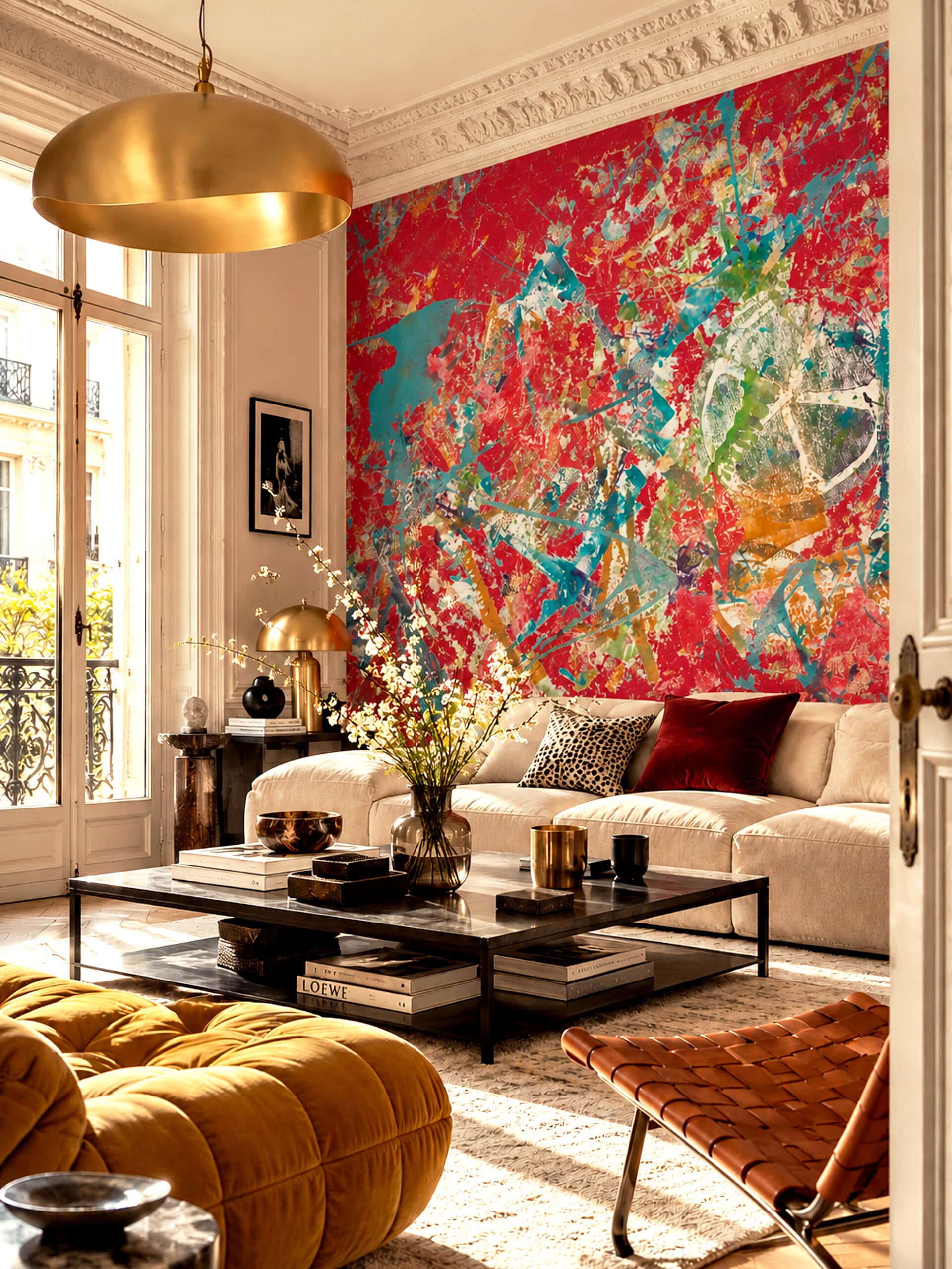
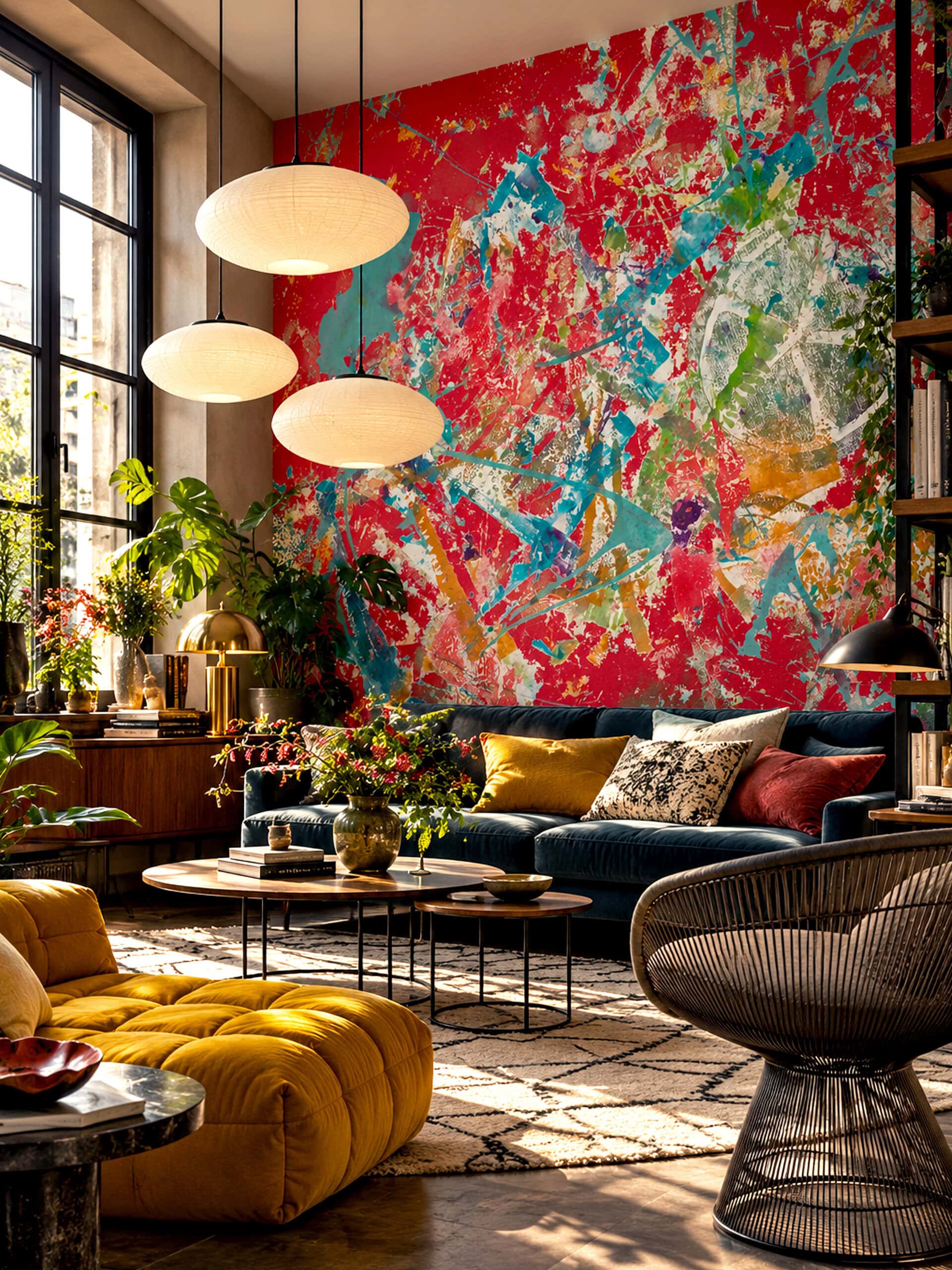
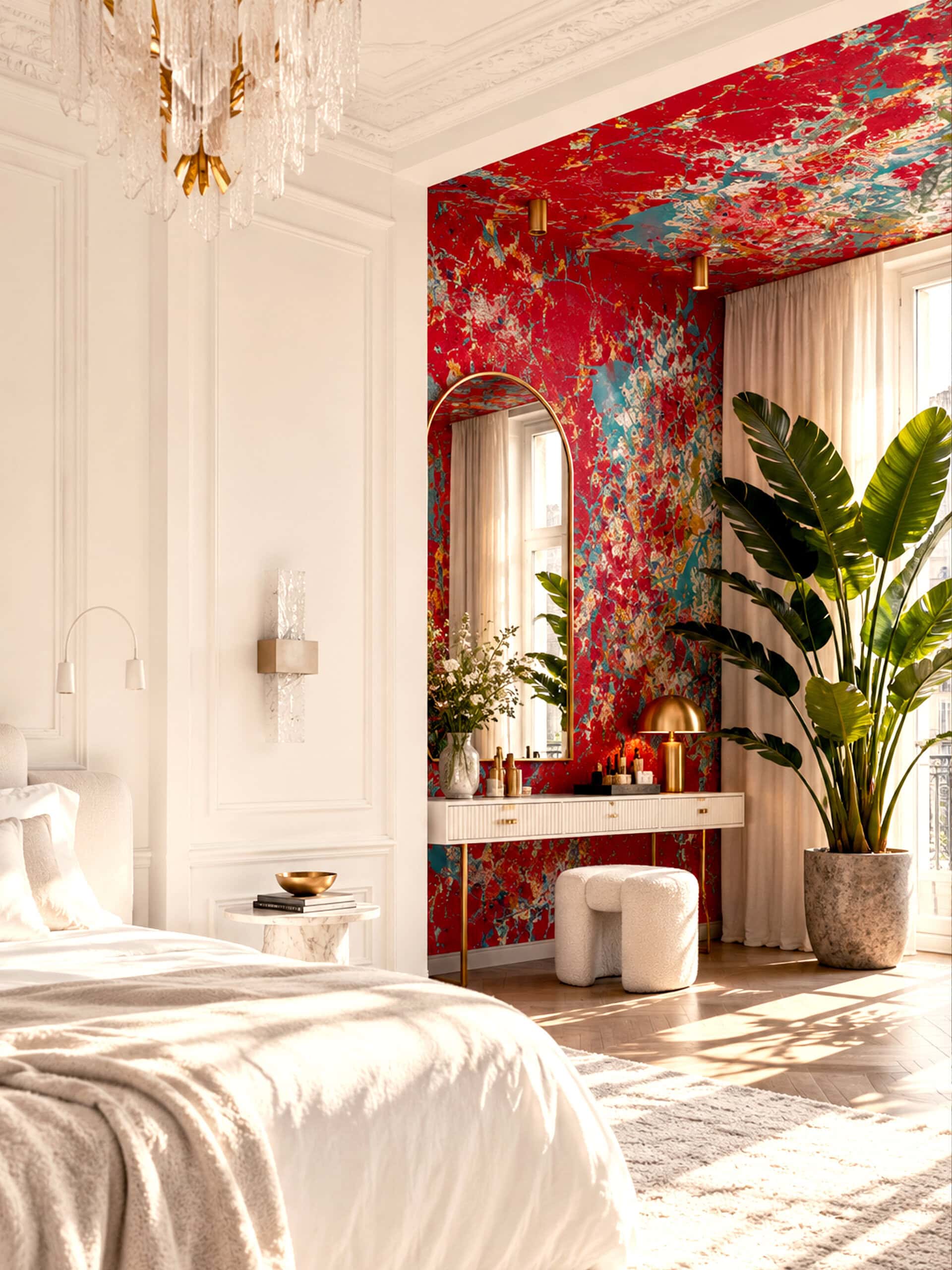
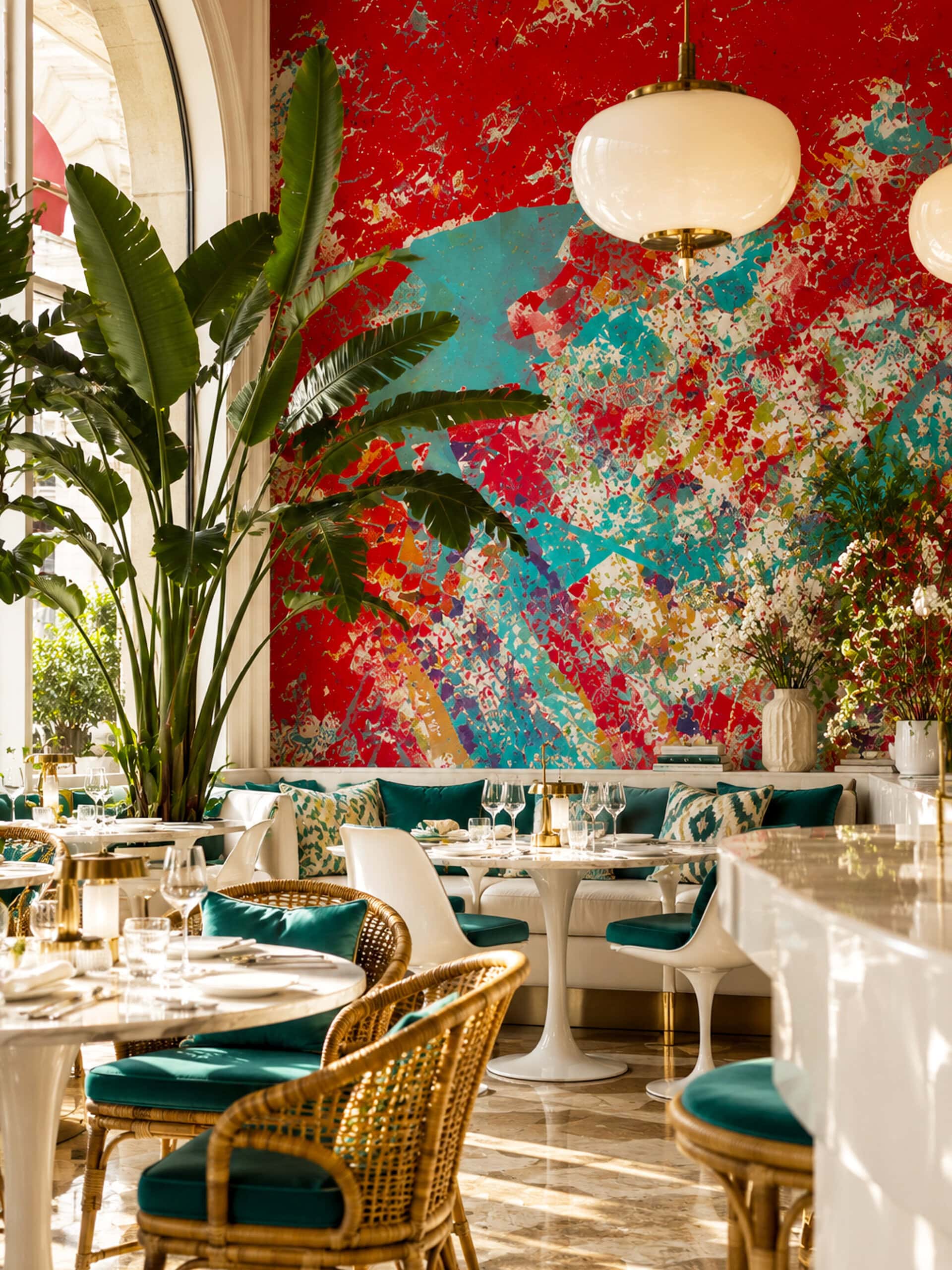
Red Abstract Wallpaper is a large-scale mural of scarlet and vermilion, broken open by sweeping turquoise splashes, streaks of ochre, flashes of green and violet, and layered fragments of printed texture. Rooted in the gestural freedom of mid-century abstraction, it reads less like a pattern than a single, fearless painting stretched across the wall. Made for living rooms, hallways, bedrooms and restaurants with architecture to match, it sits naturally alongside cream upholstery, walnut, brass, travertine and rattan.
270 421 Ft420 × 280 cm (széles × magas) · 63 EUR per sq m
What is red abstract wallpaper?
Red abstract wallpaper is a wallcovering in which red is the dominant colour and the composition is built from gestures, colour fields, lines and textures rather than recognisable subjects. Shades such as scarlet, vermilion and crimson establish its character, while contrasting colours introduce movement and depth.
Produced as a mural, red abstract wallpaper unfolds across the wall as a continuous composition. Broad gestures register from a distance, while layered marks and printed textures reward closer attention, allowing the surface to play a role similar to a large painting within an interior.
How did gestural abstraction change painting?
Gestural abstraction made the painter’s movement visible. Jackson Pollock is its best-known example. As the Whitney Museum of American Art describes, the skeins of paint in his Number 27, 1950 record his movements as he dripped, poured and flung ordinary house paint onto a large, unstretched canvas tacked to the floor. His gestural marks dissolve every discrete element into an all-over composition that covers the entire surface. Pollock himself remarked: „On the floor I am more at ease.”
The Peggy Guggenheim Collection in Venice notes that Peggy Guggenheim recognised Pollock’s talent in 1943 and offered him a contract with her New York gallery, Art of This Century, and that his works from 1942 to 1947 trace his transition to dripping and pouring paint onto a canvas laid on the floor. That same year, she commissioned him to paint a mural-scale canvas for the entrance of her New York apartment building, an early sign of how naturally gestural painting could belong to an interior.
The idea of an all-over composition is particularly relevant to wallpaper: a surface without a single focal point, where energy is distributed evenly across the wall.
Why has red been such a powerful colour in modern interiors?
Few works show the power of red to transform a room more clearly than Henri Matisse’s The Red Studio (1911). The painting depicts the artist’s studio, yet most of the room, its walls, floor and even its furniture, is rendered in a single deep red. In 2022–23, SMK, the National Gallery of Denmark, and The Museum of Modern Art reunited the painting for the first time with the surviving works of art it depicts.
Technical research published in connection with the exhibition, available through the Royal Danish Library, revealed the full extent to which Matisse had completed the painting before applying its hallmark colour, which he called Venetian red, over an original palette of blue, pink and ochre. Red was not a background added at the start; it was a decision that redefined the whole room.
That lesson still holds for interiors: a large field of red does not simply decorate a space, it changes how every object within it is seen.
How do you style red abstract wallpaper?
Style red abstract wallpaper as a substantial artwork within the room, considering its relationship with the largest pieces of furniture first. A sofa with a clear silhouette, a generous timber table or a sculptural armchair can give expressive painted marks a considered architectural setting. Allow enough of the wall to remain visible for the composition to be appreciated.
A room with red abstract wallpaper benefits from selective colour connections. A turquoise ceramic, an ochre textile or a violet glass object can draw out individual passages in the design. One or two references are usually enough; plain upholstery and quieter surfaces give those connections greater clarity.
What colours and materials work with red abstract wallpaper?
Red abstract wallpaper works well with cream, chalk white, warm timber and pale natural stone. Oak and walnut introduce grain and warmth, while travertine, linen and wool provide tactile surfaces that complement a layered painted composition. Aged brass and amber glass develop a warmer palette; brushed steel introduces a cooler, more precise accent.
Supporting colours for red abstract wallpaper should follow the undertones of the design. Turquoise and blue-green create a pronounced cool contrast with scarlet, while ochre, tobacco and terracotta establish a warmer relationship. The balance depends as much on proportion as on colour: a large cream sofa has a different visual weight from a small blue vase.
Does red abstract wallpaper make a room feel smaller?
Red abstract wallpaper does not automatically make a room feel smaller. The perception of space depends on the composition, lighting and furniture arrangement. Lighter passages and open intervals between painted marks can create visual depth, while a darker, denser design can produce a more intimate atmosphere.
In a smaller room, red abstract wallpaper can be balanced with pale adjacent surfaces, well-proportioned furniture and clear sightlines. Before deciding, it helps to consider how the red will read in both daylight and evening light, and how it will relate to the room’s existing finishes, from flooring and joinery to textiles and metalwork.
Red Abstract Wallpaper by Vesper Royale was created to hold exactly this kind of wall. Scarlet and vermilion meet sweeping turquoise, ochre, green and violet in a composition that works as a single, gallery-scale painting. Look closely and a vast, ghostly citrus disc surfaces among the layers: the imprint of a halved orange, drawn from life and carved by hand into a linoleum block in the Vesper Royale studio, then printed into the composition with every gouge mark intact. The same linocut appears, transformed into small nocturnal moons, in our Dark Purple Wallpaper. The mural is designed at 420 × 280 cm; for other sizes or an alternative palette, select „Want any changes?” on the product page.
Bold patterns need bold walls — minimum order 5 m². Enter your wall size in cm and we'll calculate the price for you.

Not sure yet? Touch it first.
Pick 3 samples.
Get 2 more on us.
Keep them, or pass them to a friend who's still living with beige. Spread the vibe — it always comes back around.
Made to order — production takes 5-7 working days, then shipped to your door.
Not sure this is right for your room? Write us an email or book a free 1-hour design consultation →
The Story
Styling This Wallpaper
Bought it.
Loved it.
Brag about it
We're a small studio, not a brand with a review army. Every word you leave here matters a lot to us, and it helps the next person find their wall.
— Barbara & the studioQuestions About This Pattern
Do I need an interior designer to choose the right wallpaper?
Not necessarily. Most people can choose confidently on their own — and if you'd like a second opinion, email us or book a free 1-hour design consultation with the studio for guidance on colour, pattern and placement. A paid consultation is only needed if you're after a full interior design service for your space, beyond just choosing a pattern.
Can I order a sample of this wallpaper first?
Yes — ordering a sample is optional but recommended. Screen colours can differ slightly from the printed result, so a sample confirms the exact tone in your own light before you commit to the full wall.
Can I customise the size or colour?
Size is always made to your exact wall dimensions — just enter height and width. Colour customisation is available for most designs; this piece is part of our standard collection, not a limited-edition print, so recolouring is possible on request.
How long does production take?
5-7 working days. Every Vesper Royale wallpaper is made to order — we hold no stock — so production begins only once you place your order.



Értékelések
Még nincsenek értékelések.