

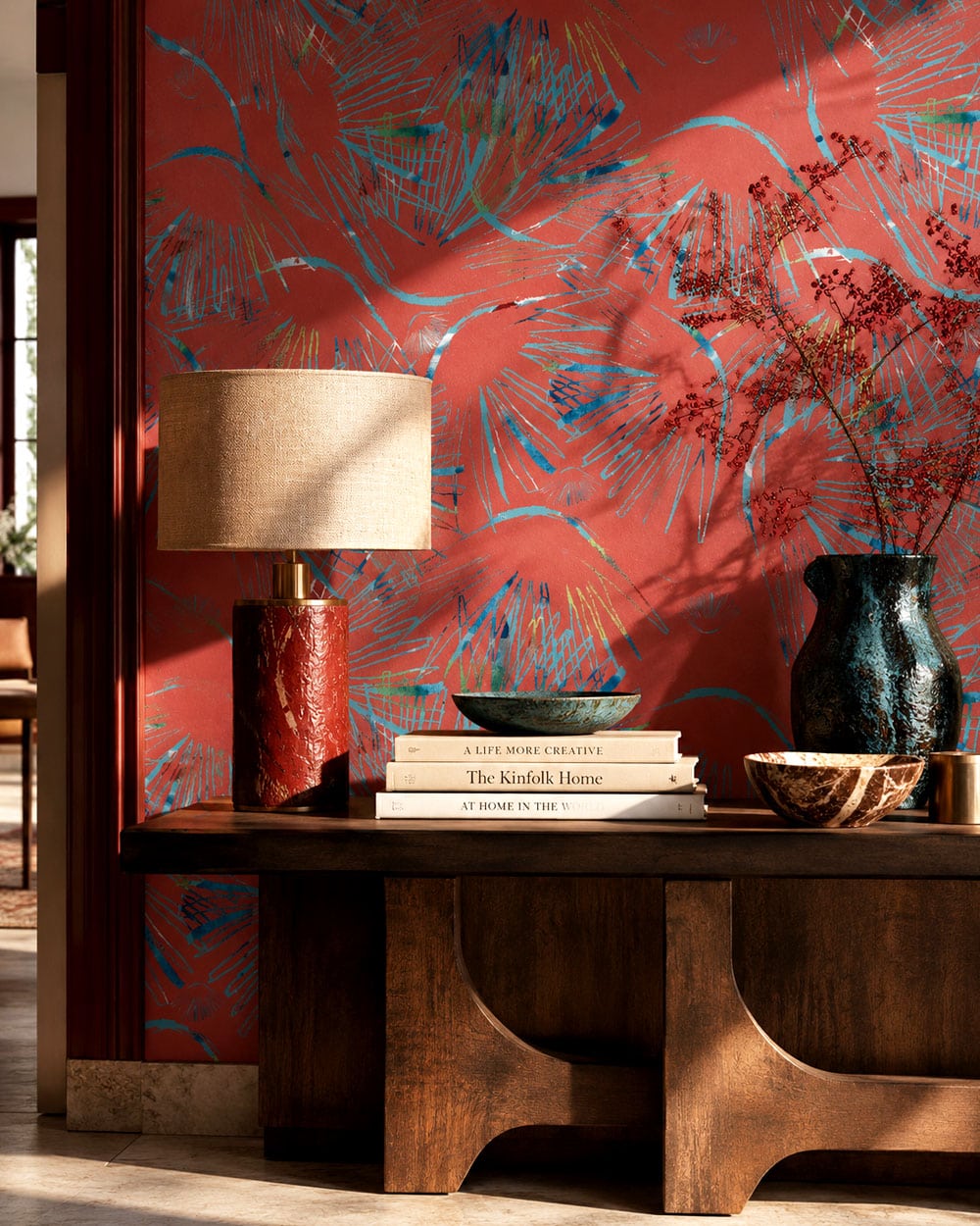
Palm Paradise Collection · Palm Paradise Opium
22 995 Ft
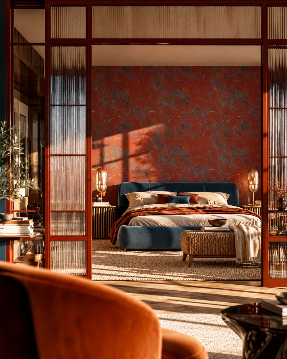
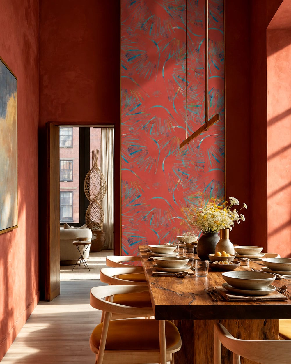
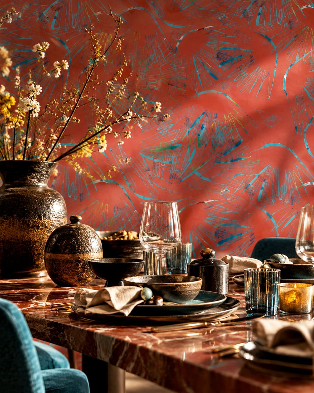
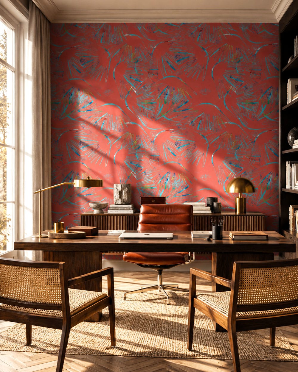
Art Deco was never particularly interested in disappearing quietly into the background. Its interiors embraced contrast, polished surfaces, precious materials and colours capable of holding their own against black lacquer, dark timber, brass and gold. Red was especially effective in that company. Deep scarlet, burgundy and cinnabar tones could look extraordinarily rich beside black and metallic finishes — a combination that also had a much older precedent in East Asian decorative arts. Chinese lacquer, for example, was traditionally coloured particularly with cinnabar red and carbon black, sometimes combined with gold or mother-of-pearl. The Metropolitan Museum of Art’s collection of Chinese lacquer includes spectacular examples of precisely this red-and-black visual language. That makes red particularly convincing in an Art Deco-inspired room. It has enough visual weight to stand beside dark furniture and architectural geometry without becoming background decoration. With Red Art Deco Wallpaper, I’d let it do exactly that.
Art Deco didn’t suddenly discover Asia in the 1920s. European designers had been fascinated by East Asian decorative arts for centuries, and by the late nineteenth century Japanese design in particular had become enormously influential. During the Aesthetic Movement, European interiors enthusiastically adopted Japanese fans, ceramics, textiles and stylised motifs. The V&A’s history of the Aesthetic interior describes wallpapers and textiles drawing simultaneously on Japanese, Chinese, medieval and other decorative sources. Art Deco inherited that fascination but gave it a distinctly modern treatment. One wonderful example is Jean Dunand, who learned traditional Asian lacquer techniques from the Japanese master Seizo Sugawara in Paris in 1912 and subsequently combined them with contemporary geometric forms. The Metropolitan Museum of Art describes his lacquer screens as quintessentially French Art Deco despite the ancient Asian technique behind them. Even Cartier joined in: a circa 1925–30 lacquer box in the Met combines red and black lacquer with Chinese-inspired materials and forms; the museum notes that Art Deco Chinoiserie became hugely popular. The Metropolitan Museum of Art Art Deco was, in other words, very good at borrowing from history and returning in evening dress.
Red has carried auspicious associations in Chinese visual culture for centuries, appearing across textiles, lacquerware, architecture and festive decoration. It is strongly associated with happiness, prosperity and good fortune, which is why red becomes particularly visible during celebrations such as Lunar New Year.The connection between red and Chinese decorative arts is also material, not merely symbolic. Cinnabar — a brilliant red mineral pigment — was historically mixed with lacquer to produce richly coloured surfaces, and carved red lacquer became one of China’s most distinctive decorative traditions. The Metropolitan Museum of Art’s collection of cinnabar lacquer traces the use of red pigment in Chinese lacquer back many centuries. That history gives red something beyond simple visual drama. Against black, gold or deep blue it can feel simultaneously celebratory, luxurious and surprisingly timeless. A fairly impressive career for one colour.
Start with the colours already doing the heavy lifting. Deep blue or petrol can temper the intensity of red without making the room neutral. Black introduces definition, while brass, bronze or aged gold picks up the glamorous side of Art Deco without turning the interior into a period set. Turquoise is particularly interesting because it creates a cooler counterpoint to red. Rather than trying to make the two colours match, allow the contrast to be visible — that tension is part of what makes the combination work. For furniture, I’d go quieter in shape and richer in material: dark timber, lacquer, velvet, leather, marble or a beautifully simple upholstered piece. Cream can provide breathing space, but an entire room of beige furniture isn’t required simply because the wallpaper has opinions.
| Colour | Piros |
|---|---|
| Room | Bedroom, Dining Room, Living Room, Office |
| Style | Art Deco, Maximalist |
Vélemény írásához lépj be előbb.







Értékelések
Még nincsenek értékelések.