
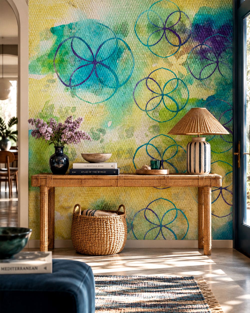
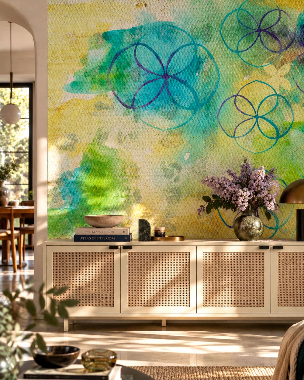
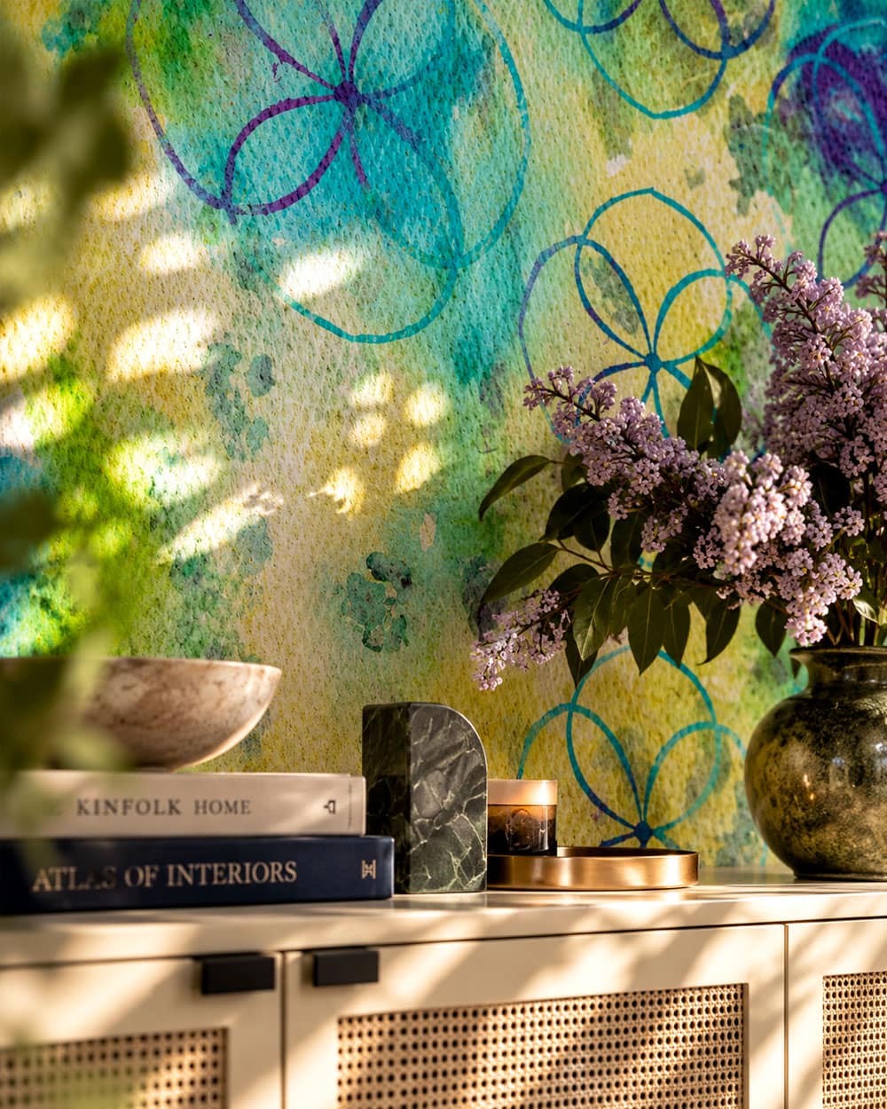
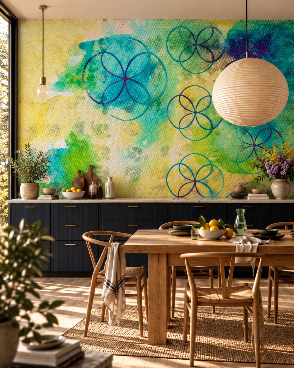
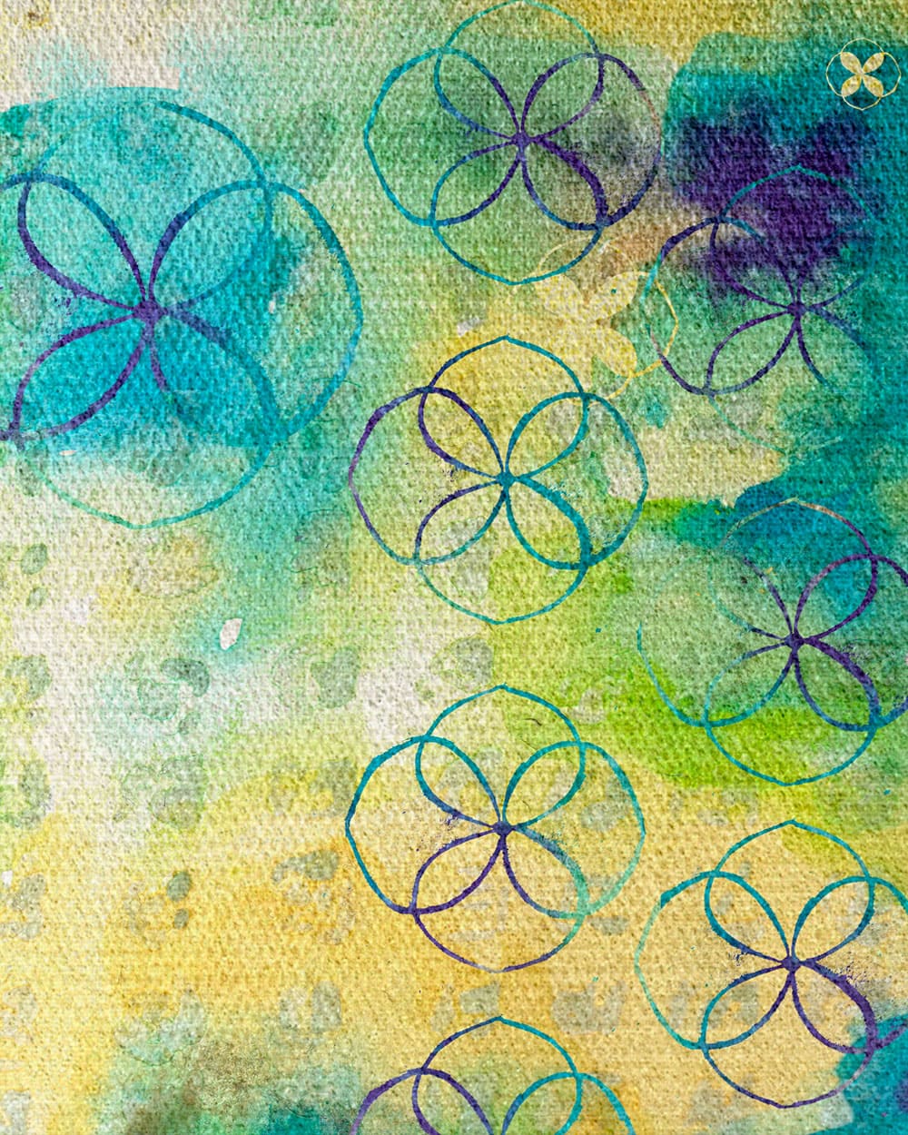
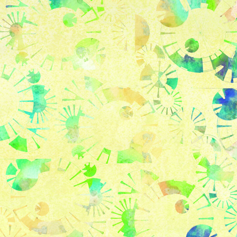
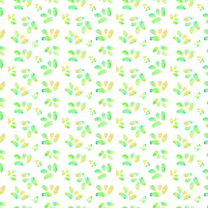
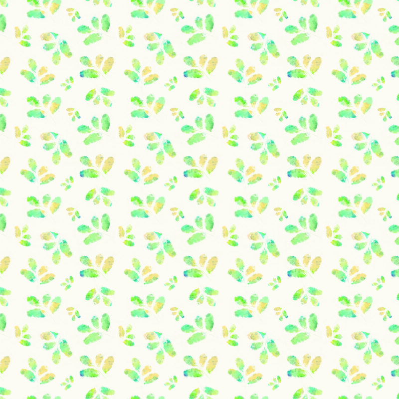
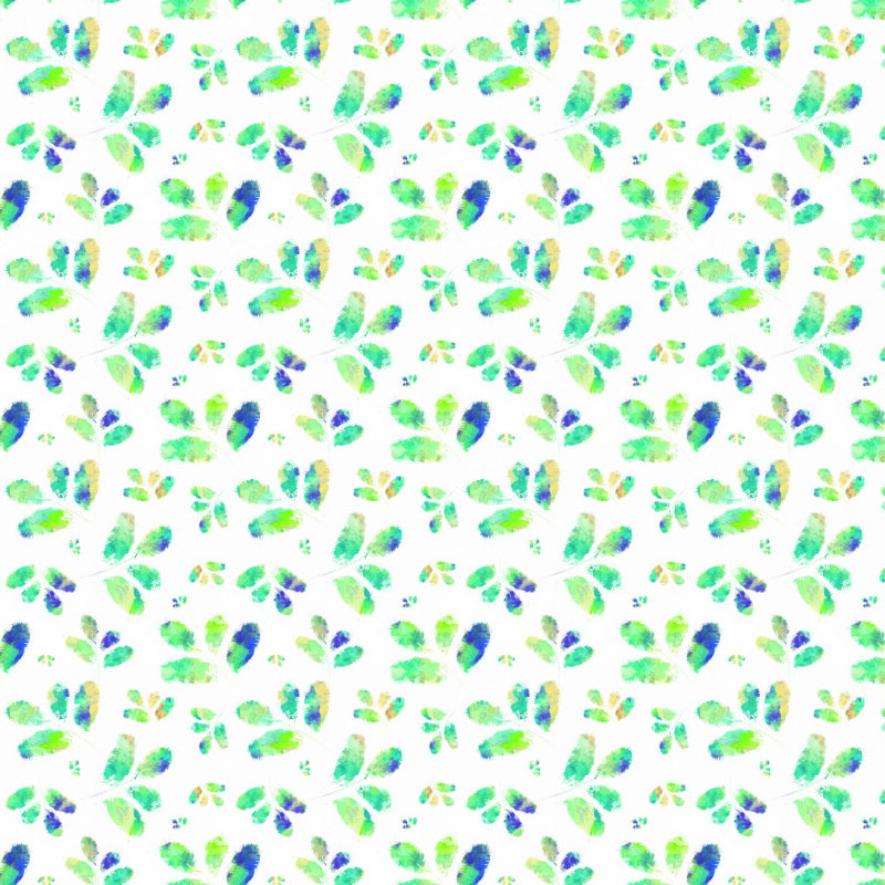
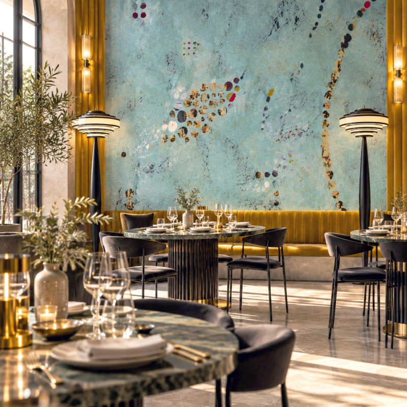
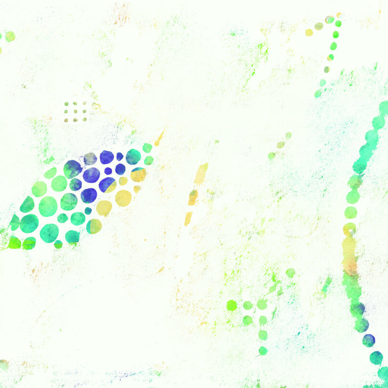
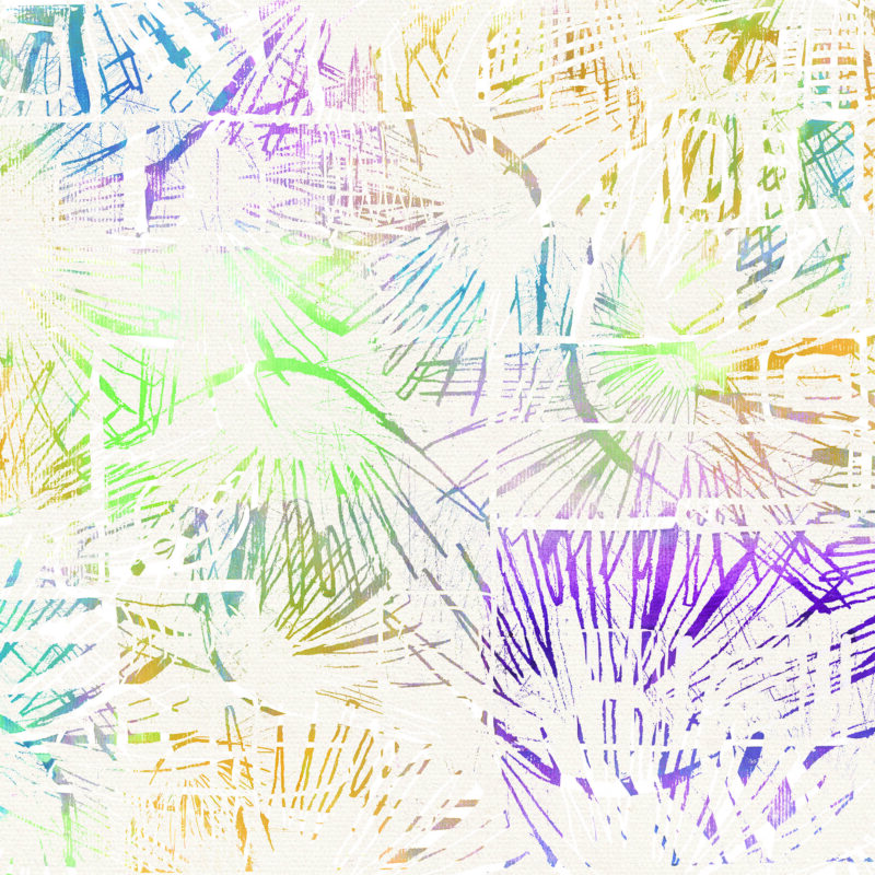
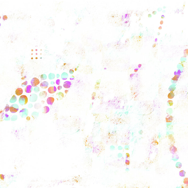
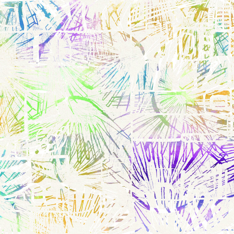
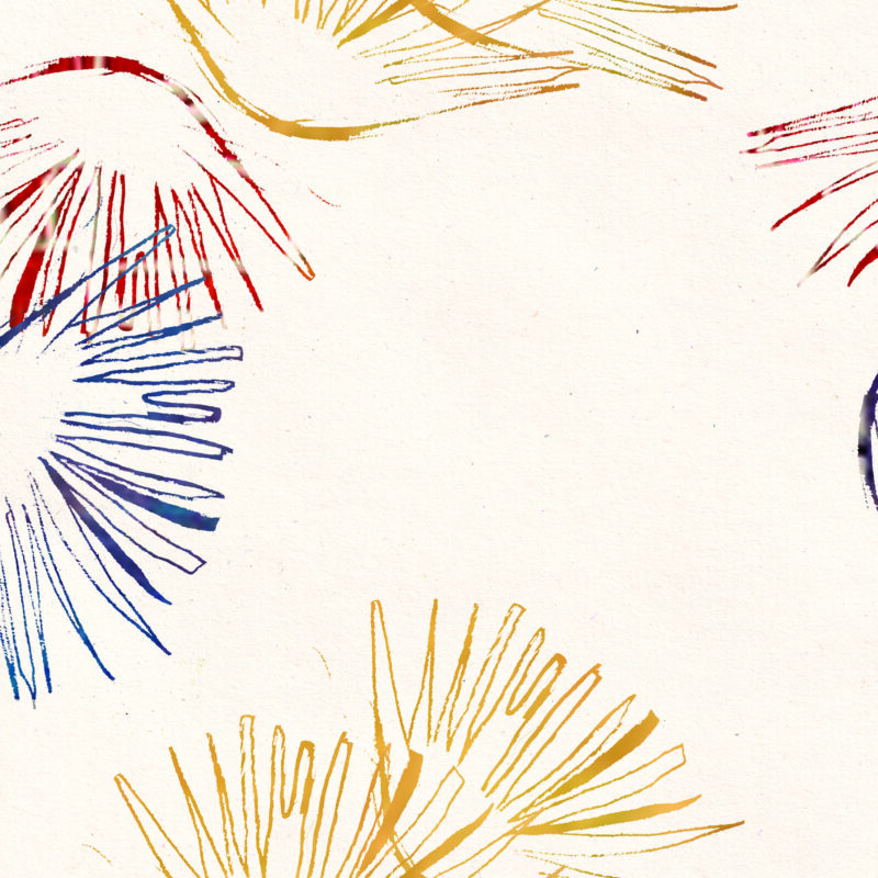
Turquoise Floral Wallpaper began as a hand-painted canvas, preserving the irregular marks, layered colour and visible texture of the original artwork. Loose floral forms emerge through washes of turquoise, green, yellow and deep blue, somewhere between botanical drawing and abstract painting. Despite the colour, generous areas of softer ground keep the pattern from feeling heavy. Pair it with warm wood, cane, stone, brushed brass and simple contemporary furniture — let the wall do the complicated part.
€63 per sq m
Turquoise is surprisingly accommodating. Sitting somewhere between blue and green, it can feel cool and aquatic in one setting and richly botanical in another. Cream, warm white and pale stone soften its intensity, while olive, moss and deeper greens create a more layered, garden-like palette. For contrast, ochre, rust, tobacco and a small amount of burgundy bring warmth without fighting the blue-green tones. Materials matter just as much as colour. Walnut and oak make turquoise feel warmer; cane and linen introduce a softer, more informal texture; aged brass adds a muted glow. With Turquoise Floral Wallpaper, there is no need to repeat every shade from the pattern elsewhere in the room. Choose one or two colours to echo and allow the rest to develop more freely. The most convincing interiors rarely look as though every object arrived on the same delivery van. Colours can belong together without matching — and a room often becomes more sophisticated when they do.
Not necessarily. The idea that dark or colourful walls automatically make a room appear smaller is far too simplistic. Pattern scale, contrast, natural light, ceiling height and the amount of visual clutter in a room can have just as much influence on how spacious it feels. Turquoise has another advantage: blue and green are colours we instinctively associate with landscape, water and distance. A turquoise pattern containing lighter areas or visible background can therefore create surprising visual depth rather than making a wall feel as though it is advancing into the room. In smaller spaces, Turquoise Floral Wallpaper can be balanced with visually quieter furniture and areas of negative space. But there is another approach: stop trying to make the room look bigger. A powder room, entrance hall or reading corner can become far more memorable when its smallness is embraced and the walls are allowed to create an immersive atmosphere. Sometimes the better question isn’t “How can I make this room look larger?” but “How can I make it more interesting?”
Flowers have been intertwined with wallpaper for centuries. Hand-painted Chinese wallpapers exported to Europe in the 18th century were particularly admired for their sophisticated depictions of plants, flowers and birds, and European makers subsequently developed their own interpretations. By the 19th century, designers increasingly treated plants not simply as subjects to reproduce literally, but as material for pattern. William Morris is a famous example: flowers, leaves and stems were observed from nature and then reorganised into stylised compositions with their own rhythm and structure. That idea still feels remarkably contemporary. A floral wallpaper does not have to resemble a botanical illustration. Flowers can be reduced to circles, outlines, brushstrokes and fragments until the pattern sits somewhere between nature and abstraction — exactly the territory that makes contemporary floral wallpaper interesting.
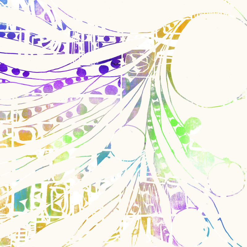
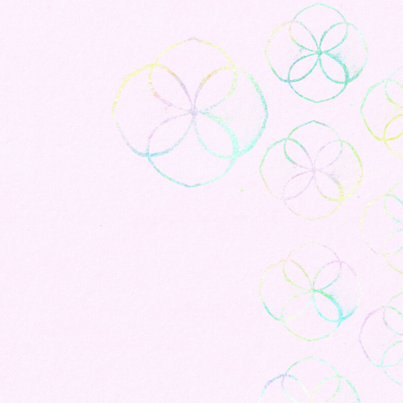
One of the most recognisable is shippō, a traditional Japanese pattern constructed from overlapping circles. Where the circles intersect, they form petal-like shapes, creating an intriguing visual ambiguity: look at it one way and you see geometry; look again and you begin to see flowers. Interlocking-circle motifs have a remarkably long history in Japanese decorative culture. Examples survive among the eighth-century treasures of the Shōsōin in Nara, and related patterns later appeared across textiles and decorative objects. The name shippō translates as “seven treasures”, referring to precious substances described in Buddhist texts. What makes the pattern particularly relevant to contemporary design is its ability to move between mathematical order and nature. Loosen the perfect circles, paint rather than draw them, let their edges wander and their colours overlap, and the geometry begins to turn botanical. That transformation is part of the thinking behind Turquoise Floral Wallpaper. Its flower-like forms are not botanical illustrations in the conventional sense; they emerge from repeated circles, imperfect lines and overlapping painted marks. An ancient geometric idea becomes something much freer — somewhere between pattern, flower and abstract painting.
Start with material, proportion and silhouette rather than trying to colour-match the wall. Warm walnut or oak provides a natural counterpoint to blue-green tones, while cane and woven fibres introduce texture without adding another demanding pattern. Aged or brushed brass works particularly well because its warmth brings out the yellows and greens hidden within turquoise. There is also no reason to restrict a painterly floral wallpaper to one period of furniture. A clean-lined contemporary sofa can make an intricate wall feel sharper and more architectural; a sculptural chair introduces another strong shape; an antique chest or old side table contributes patina and the sense that the room has developed gradually. Mixing periods can actually make a patterned interior easier to live with. When everything is perfectly coordinated, a bold wallpaper can begin to feel like part of a decorative scheme. Surround it with pieces of different ages and characters and it becomes part of the room instead. The rule isn’t that pattern needs plain furniture. It’s that complexity needs somewhere for the eye to rest.
| Colour | Green, Turquoise, Yellow |
|---|---|
| Room | Bedroom, Dining Room, Living Room |
| Style | Floral, Maximalist |
You must be logged in to post a review.











Clara B. –
“The sample was much more painterly than I expected. You can actually see the irregular marks rather than that very flat digital look some wallpapers have. Love it!”
Lucy P. –
“Our furniture is mostly contemporary and I was worried the wallpaper might make everything feel too bohemian. It doesn’t. If anything, the contrast makes the room feel more considered. Just the right fit.”
Julia, Budapest –
“The fact that the design was sized specifically for our wall was one of the reasons we ordered. We have an awkwardly wide wall and I was worried about where the pattern would fall, but everything was adjusted before production. Such a practical way to order wallpaper.”